
Saturday 13 December 2014
Monday 24 November 2014

Wednesday 5 November 2014

Sunday 25 May 2014
Paintfusion to Pastelfusion!
Hi Everyone! <----- Annabel
We recently did a Paintfusion workshop with Helen and I purchased some of the lovely Paintfusion outline stamps by Sheena Douglass.
I loved using them with paints but also thought they would be fun to do with pastels on kraft card. I've admired the effect several time in craft mags and fancied a go!
Here is what I did, I hope it inspires you and I would love to see what you make with it! :)

So I started with the Poppies Stamp Set and a 15cmx15cm kraft card blank and envelope.
 Using white pigment ink I stamped the flowers and leaves on to the card blank not caring much about over lapping but trying to make sure everything would be covered up when I started to fill in the images.
 Once the images were stamped it was all looking a bit complicated so I carefully traced around my flowers in red pastel so they were picked out from the line mess. Then I was able to work out which bits remaining were leaves. I added in any stalks that were missing at this point too. It was now clear what was what! :)
Poppies are darker coloured at the centre of the flower and lighter as they fan out - this picture shows the stages I went through. The bottom left flower shows the outline and dark centre part. Bottom right flower is
 blending in the red with a more orangey hue. Then to the central flower I added dark areas with burgundy/brown and at the edges white for highlights. It is easy to blend colours using your white pastel, your finger, or a blending tool. It might be worth practicing a bit of blending first on scrap card.
Some of the leaves needed more details picked out using darker green and white for highlights. I darkened the centre of my flowers with dark brown and added some wisps around the area where the seed head part would go.
 Paintfusion isn't very detailed by nature ( part of its charm!) but with the pencil pastels I could more easily create more definition. I found some nice images online to use as reference material and then added black and green to form the centre of each flower.
I also added hairs to the stems of the flowers using fine strokes of white pastel.

Once the image was coloured in I used a normal pencil eraser to clean off any smudges or marks I'd made.
I also used a cheap can of hairspray to set the pastel so it would stay put!
 After printing a greeting on the computer and adding a few gems - Finished Card!
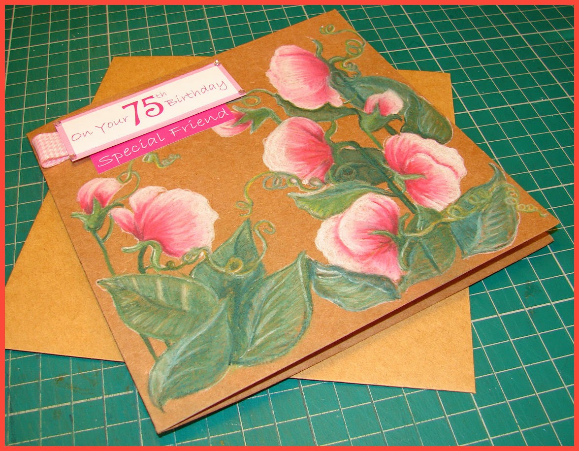
I hope you fancy a go now too? :) Let me know how you get on, and ask any questions you might have along the way.
Sunday 23 March 2014
Village In A Box, Tando Kit, Workshop taught by Helen Haines.

Thought I would share some photos of my Village in a Box, now it is finally finished! This was a brilliant course that Helen ran, last year? Was it really so long a go? Gosh. I am slow to post pics...
Though I assembled this mainly in the workshop I didn't have much time to add all the details I wanted....two hours is never enough! I purchased some die-cut icicles that I added to the houses and to the outer edge of the box. The model trees were anchored down using air-dry clay. The penguins were purchased from a toy shop! And the rosette originally intended for on top of the box ended up on the ramp/flap displaying the greeting when the box was opened.

The main change I made at home was that I extended the base of the box to include a hidden compartment for the battery pack. The underneath of the box still has a hexagon of snowy paper as a covering but there is a tiny slot for you to reach the on and off switch for the lights! Whilst two houses got a full set of lights, the final house had a few inside, to make it look like someone might be at home.

I did purchase a Momma Penguin for inside the box too but the scale was just all wrong, so she is now a figure head/handle on the lid! I used the extra die-cut icicle strips to disguise the false bottom of the box.
All done! Don't think it'll ever be for sale, too much time and energy spent to work out what the price would be :) Also....model trees are darned expensive!
Thanks for reading. Thoroughly recommend this workshop if Helen does it again. :)
Workshop info normally on our facebook page.
Sunday 9 February 2014
ATC Holder Tutorial
Hi Again Everyone! <----- Annabel :)
We've started to get some fantastic ATC's at Craft Club now and I thought you might like to make a small ATC holder to keep them safe. Here are the basics for a simple design, it can obviously be enhanced and embellished to your heart's content!
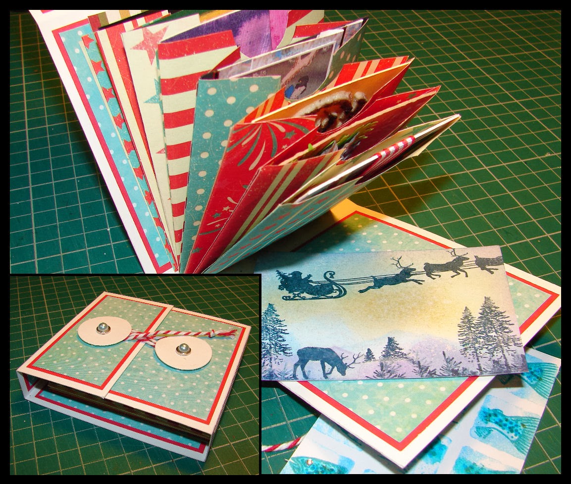
For the ATC holder I used one A4 sheet of white card, bonefolder, craft knife, scissors, 5 sheets of coloured paper, double sided tape, 2 brads, 2 die-cut circles, pokey tool, foam poking mat and baker's twine.
Blue spotty paper from "Tis the Season" collection by Bobunny. Other papers from "Stars and Stripes Collection" from Craftseller magazine. This project is an ideal way to use up some of those freebie craft papers, especially the two sided kind!
 1. To start with I cut out the two main elements. The top one is to make the outer part of the holder and measures 29cm x 9 m. The bottom one is to make the individual pockets in the holder and measures 18cm x 7cm. Score, fold and cut both as shown.

2. Next cut out the paper needed for the matting and layering on the outer holder. As we are covering inside as well as outside you will need to make two sets. Use the dimensions shown in the picture.
(You will need 2 of 8cm x 4cm, 3 lots of 8cm x 1cm and 4 lots of 8cm x9 cm.)
When I have finished cutting the blue paper to size I mounted all the pieces on to red paper.

3. Stick your matting and layering pieces to the outside of the holder with double sided tape. (Don't do the inside yet!)
Measure to the centre point of the 5cm flap and bodge through a hole.
Push a brad through a diecut card circle and then through the bodged hole. Secure on reverse.
Do the same with the lower flap.

4. You can now wrap some Baker's twine around/behind the circles and create a fastening to hold the folder shut. Wrapping in a figure of eight pattern looks nice! It's surprisingly secure.
 5. Now open the holder and use tape to attach the remaining matted pieces. You are now covering up the messy side of the brads too. Don't attach anything to the section marked "A", leave it as it is.
 6. Now it's time to make the ATC pockets. I used double sided paper and started by cutting it into 18cm x 9 cm sections. I then used my pocket template to mark out the rest of the design.
I cut eight pockets for this tutorial- but you can add more pockets if you want, or less, its a flexible system!
You could also cut all the pockets in card and then add decorative elements.
 7. When they are all cut out I chose the order I wanted to attach them in. Then I added double sided tape to the middle/back of each pocket. Next stack them up and stick them down as squarely as possible.
 8. Add additional tape to the back pocket and then attach it to the back of the folder. If you hold it upright it's easier to align the bottom of the pockets with the bottom of the folder, so they sit on the section that we left without any matting.
Finished ATC holder! It's actually pretty robust and could be altered to fit any number of pockets. A slightly different concertina effect can be made by sticking the front pocket to the front piece of the holder, but this stops you adding more pockets at a later date. Hope you feel inspired!

We've started to get some fantastic ATC's at Craft Club now and I thought you might like to make a small ATC holder to keep them safe. Here are the basics for a simple design, it can obviously be enhanced and embellished to your heart's content!
For the ATC holder I used one A4 sheet of white card, bonefolder, craft knife, scissors, 5 sheets of coloured paper, double sided tape, 2 brads, 2 die-cut circles, pokey tool, foam poking mat and baker's twine.
Blue spotty paper from "Tis the Season" collection by Bobunny. Other papers from "Stars and Stripes Collection" from Craftseller magazine. This project is an ideal way to use up some of those freebie craft papers, especially the two sided kind!
2. Next cut out the paper needed for the matting and layering on the outer holder. As we are covering inside as well as outside you will need to make two sets. Use the dimensions shown in the picture.
(You will need 2 of 8cm x 4cm, 3 lots of 8cm x 1cm and 4 lots of 8cm x9 cm.)
When I have finished cutting the blue paper to size I mounted all the pieces on to red paper.
3. Stick your matting and layering pieces to the outside of the holder with double sided tape. (Don't do the inside yet!)
Measure to the centre point of the 5cm flap and bodge through a hole.
Push a brad through a diecut card circle and then through the bodged hole. Secure on reverse.
Do the same with the lower flap.
4. You can now wrap some Baker's twine around/behind the circles and create a fastening to hold the folder shut. Wrapping in a figure of eight pattern looks nice! It's surprisingly secure.
5. Now open the holder and use tape to attach the remaining matted pieces. You are now covering up the messy side of the brads too. Don't attach anything to the section marked "A", leave it as it is.I cut eight pockets for this tutorial- but you can add more pockets if you want, or less, its a flexible system!
You could also cut all the pockets in card and then add decorative elements.
Finished ATC holder! It's actually pretty robust and could be altered to fit any number of pockets. A slightly different concertina effect can be made by sticking the front pocket to the front piece of the holder, but this stops you adding more pockets at a later date. Hope you feel inspired!
Monday 3 February 2014
Crafty Magic Blog Challenge
Hi Everyone :) <---Annabel posting!
This month we thought we would do something new on the blog and do a blog challenge!
Last time I saw Helen she gave me a redundant little owl stamp (freebie with a magazine) and I set about making a card with it!
You are welcome to join me in the challenge and borrow the stamp for something completely different or just have a go at a card? I will bring the stamp with me to the next Craft Club. There is no time limit for this.

Here is a tutorial for the card I made.
For this card I used a 15cm x 15cm Kraft card blank and envelope, a 14cm x 14cm piece of white linen card, Distress inks, black Impress dye ink, acrylic stamping block, water pen, Cuttlebug and dies, foam pads, round corner scissors, paper straws, gardening twine and ribbon, Glossy Accents, Yellow Stickles, Heart Pearl Pins and scraps of white and brown paper.
 1. On the14cm x 14cm White Square stamp the owl image randomly all over using three different shades of Distress Inks. (I used spiced marmalade, tea dye and brushed corduroy - though any three colours will be fine!)
 2. Using the watercolouring with Distress Inks technique, add some extra colour to the stamped images. I use my acrylic block to squidge out some distress ink and then use it like paint with a waterbrush. (Some water and a normal brush would work just as well.)
 3. When the inks were dry I used my "corner" scissors to shape the stamped card and the Kraft card blank I was adding it to. I cut the bottom two corners off making it a tent fold card. Do not stick it down yet.
 4. I stamped another little owl onto some smooth white card using Impress black ink and then coloured it using the watercolour technique with distress inks. This is using the same three shades as before with some extra "ripe persimmon" distress ink to make it a bit brighter.

5. When the ink was dry I used the Cuttlebug to cut it out using a circle die, and then cut a co-ordinating scallop circle from some brownish scrap paper. Stick the two together.
 6. Before sticking on to the card base I wrapped some flattened drinking straws and some hemp style twine approx two thirds of the way down the backing paper. I used sellotape to attach them to the back of the paper and to get as flat a result as possible. Stick down the backing paper to the card base and use 3D foam tabs to add on the scallop/circle topper.
 7. When the card was assembled I added some Glossy Accents to the owl's eyes and some yellow Stickles to some of their bellies. I also glued in two pearl heart pins. Then left it for an hour to dry - why does Glossy Accents take soooo long to dry?:)
 8. The Final Card! - and also another I made using a different set of Distress Inks and some vintage ribbon. The owl is also stamped on the Kraft envelope to give a co-ordinated look. I printed out an owly insert for inside too.
Hope you feel inspired to make something yourself :)
This month we thought we would do something new on the blog and do a blog challenge!
Last time I saw Helen she gave me a redundant little owl stamp (freebie with a magazine) and I set about making a card with it!
You are welcome to join me in the challenge and borrow the stamp for something completely different or just have a go at a card? I will bring the stamp with me to the next Craft Club. There is no time limit for this.
Blog Challenge Owl Card!
Here is a tutorial for the card I made.
For this card I used a 15cm x 15cm Kraft card blank and envelope, a 14cm x 14cm piece of white linen card, Distress inks, black Impress dye ink, acrylic stamping block, water pen, Cuttlebug and dies, foam pads, round corner scissors, paper straws, gardening twine and ribbon, Glossy Accents, Yellow Stickles, Heart Pearl Pins and scraps of white and brown paper.
5. When the ink was dry I used the Cuttlebug to cut it out using a circle die, and then cut a co-ordinating scallop circle from some brownish scrap paper. Stick the two together.
Hope you feel inspired to make something yourself :)
Saturday 11 January 2014
Water colouring with distress inks
I've been trying out water colouring with distress inks recently and have been very pleased with the results. You can make them pale as with traditional water colour or more intense which I preferred for the projects I was working on.

The above used a Sheena Douglass stamp set from her A little bit magical range. I blended distress inks for the background and then stamped the individual images to make the scene. Each was then painted using water and distress inks. I put the pad of distress ink onto my glass cutting mat and then used a fine brush with water to pick up the ink and colour onto the non pearly side of Centura Pearl card stock.
I stamped the brick wall on the right, toadstools and leaves individually and painted them in the same way to then decoupage onto the front of the scene.
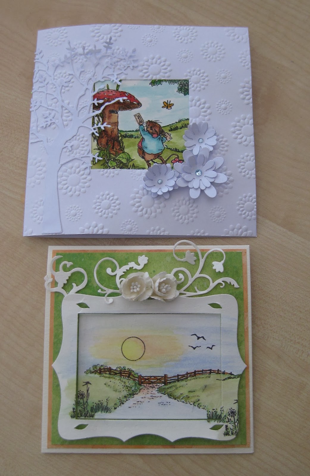
The ones above were done using the same painting method and Hobby Art scene it stamps sets to create the scene with the individual stamps.
Hope you like them. I really enjoyed painting them nice and easy and quick. Helen x
The above used a Sheena Douglass stamp set from her A little bit magical range. I blended distress inks for the background and then stamped the individual images to make the scene. Each was then painted using water and distress inks. I put the pad of distress ink onto my glass cutting mat and then used a fine brush with water to pick up the ink and colour onto the non pearly side of Centura Pearl card stock.
I stamped the brick wall on the right, toadstools and leaves individually and painted them in the same way to then decoupage onto the front of the scene.
The ones above were done using the same painting method and Hobby Art scene it stamps sets to create the scene with the individual stamps.
Hope you like them. I really enjoyed painting them nice and easy and quick. Helen x
Subscribe to:
Posts (Atom)